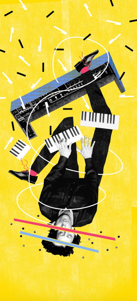
Choose the proper Technique.
While staring at a collage layout, you may bump into typography, letter fonts, painted figures, stuck objects, newspaper cutouts, glued items, and so on. We may also translate this into a final digital piece to give a three-dimensional feeling to the artwork. Some creatives use a digital approach by digitally reproducing the mixed feelings given by all the elements. The result is stunning, entirely unexpected, and very strong, as if all of those pieces were struggling before they finally encountered that final layout. They are yet happy there, in tune with one another.
Experimenting means understanding and exploring all the possible ways the elements may interact.
Choose a Theme
Are you having trouble finding inspiration for your collage? Give yourself a theme, as sometimes, setting limits can force you into making creative decisions. It can be something as simple and obvious as ‘holidays’, or abstract and open to interpretation as ‘whatever.’
Choosing a specific theme will also help you to build up a more specific image source. It is also an excellent way to churn out multiple collages or work in series, as the material you amass might be too much for just one piece of artwork. Collage Composition. A compromise between Art and Design
There is something highly emotional and intriguing in staring at a collage illustration layout.
Not only is the viewer compelled to find a hidden message, but he also has to participate in an artist’s silent manifesto. The artist uses collage to engage with a particular point of view using any tool he likes. No boundaries are allowed.
The creativity resides in the composition, which is how the artist chooses to assemble all the pieces. This creative process is what connects design with art.
Collage composition is empowered to speak artistically to the viewer through a visual language typical of a design approach.


Storytelling Tips: It’s like Entering a Room.
Try seeing your artwork through the metaphor of entering a room filled with unfamiliar people. You start by staring at everybody. The approach will be smooth, starting with something essential, like where you come from, to stick with the most people you enjoy. Then you will begin to search for the most pleasing way to interact and possibly initiate some deeper conversation. This same method will be helpful to build your collage. Attract people with direct and primary elements to keep them interested with specific details. Isn’t this a good process also for a collage?
@ Montserrat Serra@ Montserrat Serra
Follow us to constantly explore creative tips&tricks!


