


Here is a Brief Introduction to Typography
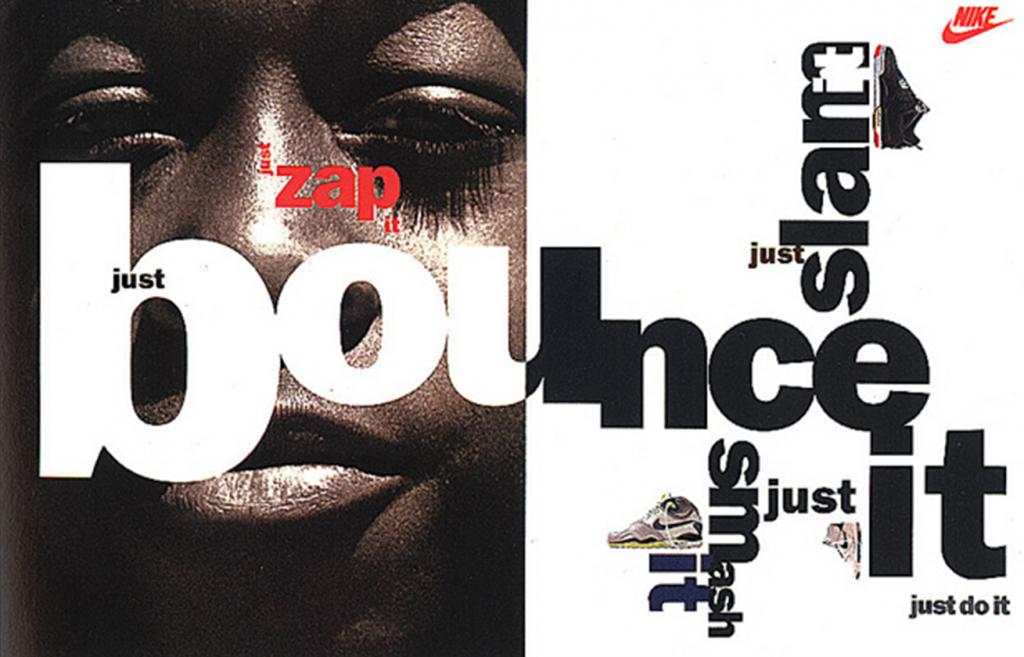
Typography is the application of letters, numbers, and symbols in writing to a graphic design composition. It is everywhere, and we eventually notice there is so much we can do with it. There’s a science behind kerning, leading, serifs, point size, line length, tracking, and more. It still covers communication skills, indeed, but it now holds also a vast visual appeal. Type fonts are shapes and forms that flow inside the layout to produce messages and feelings.
Typographic Composition
To introduce the meaning of typographic composition, we should step back a bit. Since the creation of the modern alphabet much has occurred. Nowadays, thanks to a valuable evolution in the nineteenth century, typography is finally seen as a form of art.
During World War II, the political manifestos were filled with letter fonts and brief sentences to explicitly and straightforwardly shout information. When the war was finally over, people reacted boldly to propaganda by giving it a more pleasant feel for all the nineteenth century. It was about communicating with forms and colors overall. Typography became a visual art by influencing the world of art and design.
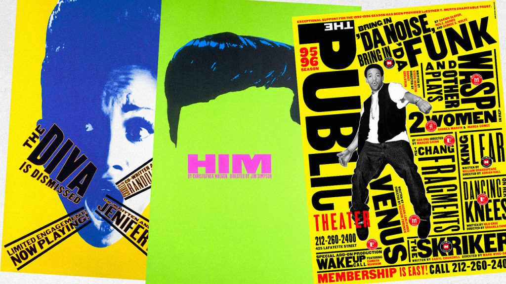
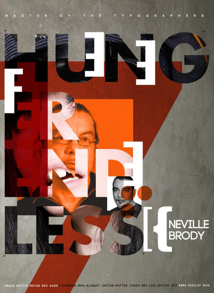
We could go now on and on mentioning famous typography composition designers as Neville Brody or Paula Scher, two of the biggest influencers of new typography and graphic design.
How to create a Typography Artwork
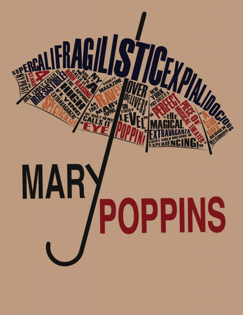
Throughout the nineteenth century, arranging typefonts became renowned as Typography design.
The typeface you choose and how it works with your layout, grid, color scheme, etc., will differentiate between a good, bad, and great design.
Font design
Font design is a long and involved process. Typefaces are created by craftspeople over substantial time, using talent honed over many years. The best, professionally designed fonts come with various weights and styles to form a complete family, carefully considered kerning pairs, multi-language support with international characters, and expressive alternate glyphs to add texture and variety to typesetting.
You’ll need to double-check the one you pick holds all the options you need to produce a great design. There’s a stunning collection of free fonts to choose from online. Or you could either design your own!
Hands-on: Creative Tip
Try strictly designing a layout using letter fonts, typefaces, or related shapes. Keep in mind to divulge a message. Try focusing on the chosen symbol’s semiotics and put yourself in the viewer’s shoes: is the message still clear, or do the shapes and forms cover it? Use whatever medium you prefer and have fun!
Get some inspiration here or follow us for more creative tips!

