


What does Typography Mean?
Think Out Of The Box and Choose Your Tools
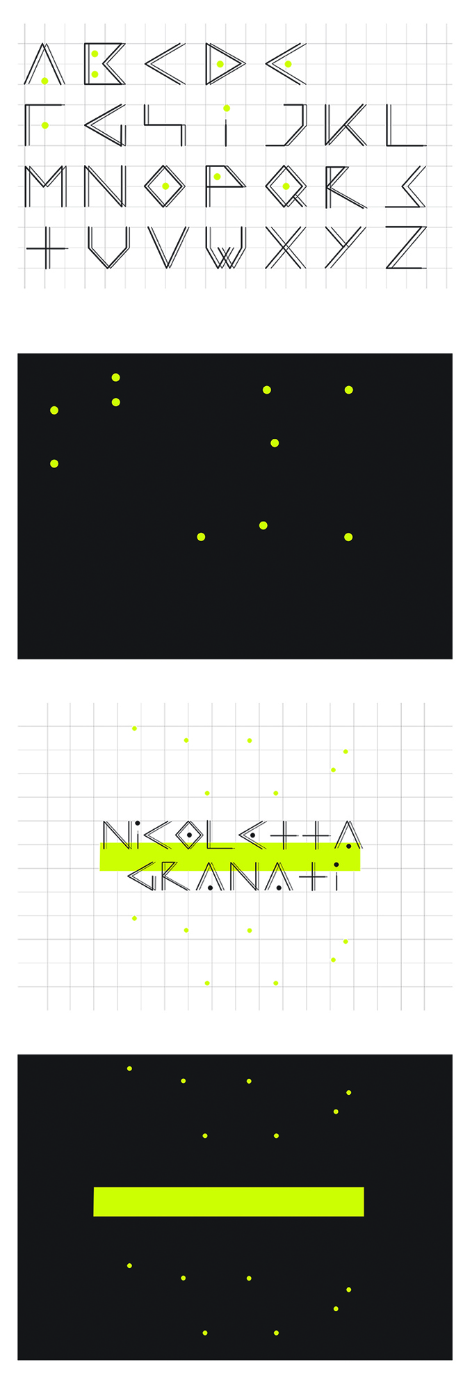
Every designer’s dream is to have a recognizable personal style. Opting for a coherent visual language that will show up in most of your professional material or work, is indeed a good starting point. A visual alphabet is by definition a group of symbols or icons that refer to a given letter (Ex: I may decide that the symbol $ refers to an A, the symbol % to a B, and so on…). According to this, let’s consider a fresh and personalized type font as a symbol.
So grab your favorite tool, which could be a sheet of paper, a graphic software such as Illustrator (or, preferably, any vector digital tool), and start sketching and creating your visual alphabet. It’s not only about letter fonts. There are shapes, empty spaces, coherency, and more to be aware of. The most important thing to creating a clear alphabet is to make each letter distinguishable. The next step is to think about consistency. It doesn’t mean that each letter has to be necessarily like the other, but it needs to relate for sure. It is advisable to keep each letter font coherent, to have a final result that may be exploitable for any use.
Make The Right Questions Before Starting
To avoid unexpected final changes, try to think about all the possible appliances you will need it for, especially the ones you will be using the most. Will I be using it for my brand identity? Or maybe for my firm’s graphic design? Will it need more than one color? Shall I consider a bold, italic, and roman version? Will it have capital and small caps?
When this is clear, start sketching from any letter you wish. Another piece of advice is to begin from a complex one as the “R”, so to explore in advance any further design and technical issues.
Finalizing the Alphabet
Once completed the alphabet why not create a visual example as proof of a good job? This could be a poster, a grid, a typography design piece. Combine all the letters and it’s done!

